Dark Horse Roastery |
Horsebox Coffee
Uniting roastery and horsebox with a local, natural touch
Tasked with a rebrand to align the two sides of the business under a consistent visual identity and to develop a unique and authentic brand heart, including mission, values and tone of voice, we built a cohesive brand that really speaks to the local, natural and independent nature of the business.
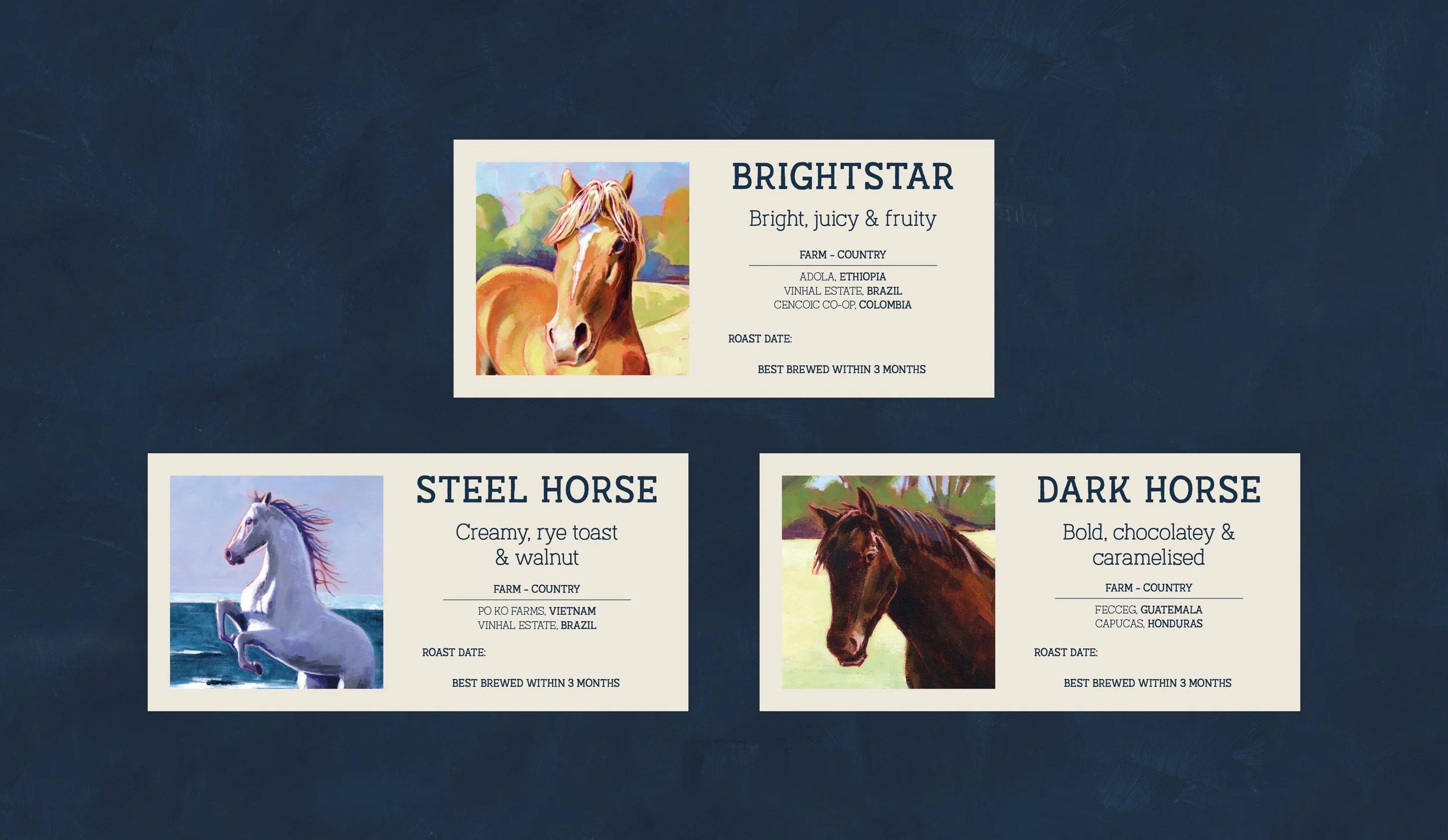
We took inspiration from Emily’s backstory, their location in the foothills of Whittenham Clumps and their emphasis on People, Planet and Flavour to create a fresh and textured identity that has real meaning and storytelling behind it all. The packaging features an outline of the clumps, the Dark Horse logo is based on Emily’s family horse, and the Horsebox Coffee logo is based on…well you know.
PROJECT SCOPE
Brand strategy
Tone of voice
Packaging
Visual identity